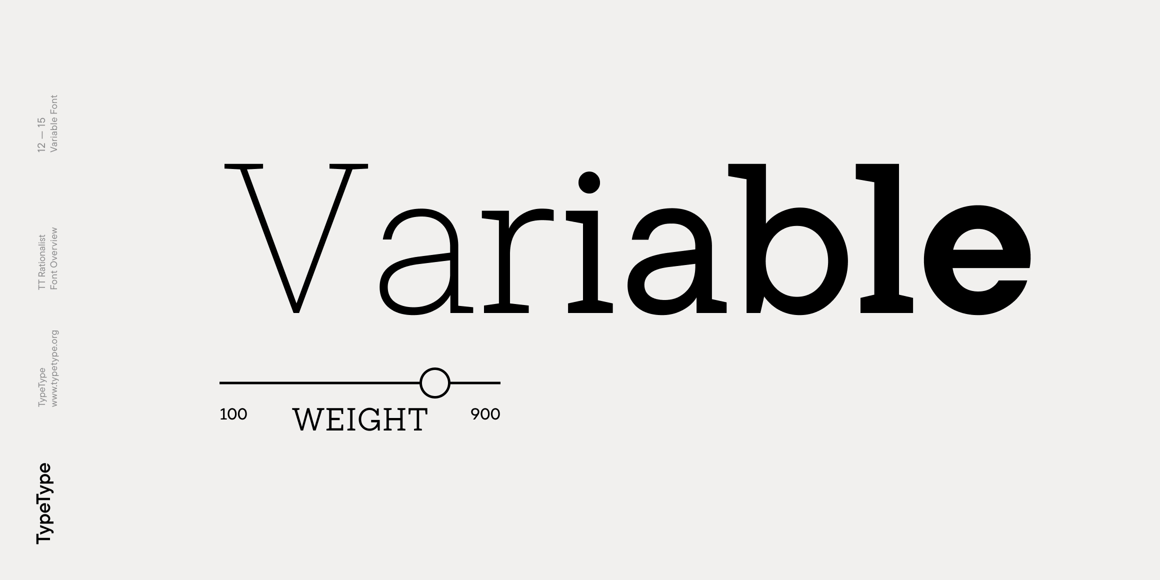
Along Slab
-
Thin
- Pack my box with five dozen liquor jugs
-
Thin Italic
- Pack my box with five dozen liquor jugs
-
Extra Light
- Pack my box with five dozen liquor jugs
-
Extra Light Italic
- Pack my box with five dozen liquor jugs
-
Light
- Pack my box with five dozen liquor jugs
-
Light Italic
- Pack my box with five dozen liquor jugs
-
Regular
- Pack my box with five dozen liquor jugs
-
Regular Italic
- Pack my box with five dozen liquor jugs
-
Medium
- Pack my box with five dozen liquor jugs
-
Medium Italic
- Pack my box with five dozen liquor jugs
-
SemiBold
- Pack my box with five dozen liquor jugs
-
SemiBold Italic
- Pack my box with five dozen liquor jugs
-
Bold
- Pack my box with five dozen liquor jugs
-
Bold Italic
- Pack my box with five dozen liquor jugs
-
ExtraBold
- Pack my box with five dozen liquor jugs
-
ExtraBold Italic
- Pack my box with five dozen liquor jugs
-
Black
- Pack my box with five dozen liquor jugs
-
Blakc Italic
- Pack my box with five dozen liquor jugs
-
You are choosing a font! There are many fonts in SandollCloud, so it is not easy to choose one. If so, I'll help. Hello, I'm Terry, born in 2021. Among Sandoll characters, I am a bit better at explaining things. First of all, it is enough to decide intuitively if you write in a short text from a few letters to a few sentences. It's like saying, 'Yeah, this is how it feels.' I recommend viewing it at 100% size in the actual environment you will be using it. Fonts have a very different feel depending on their size. There are attractive designs when they are small and attractive designs when they are large. Most fonts have a size area that stands out the most. For example, if you use a small bold font like Greta Sans Heavy, the strokes may stick together, and it may not look fresh. In that case, it is good to lower it one level to Bold On the other hand, if you are choosing a font to use for long texts ranging from a few thousand to tens of thousands of characters,I recommend a plain and stable font. It will be quite a tiring journey. In this case, it will be helpful to check the balance between the letters. Would you like to read the following words aloud as quickly and accurately as possible? Advice Advise, Compliment Complement, Healing Dealing. how is it? It will be different depending on the font. The faster and more accurate the font, the better the readability. How about changing the font in the actual text and trying to ‘read it out loud and accurately’? If it helped choosing fonts, please visit again next time~ Terry♥
Along Slab은 지오메트릭 기반의 과감한 Slab 터미널을 사용하고 있습니다. 고전적이면서도 투박한 느낌의 이 폰트들은 다양한 영역에서 디자이너들의 영감을 자극할 것입니다.
무게와 스타일과 관계없이 Along Slab에 포함된 글꼴들은 헤드라인, 브랜딩, 로고 및 영상 편집에 이르기까지 다목적 용도로 사용됩니다.
사용자 리뷰 0(0) 리뷰쓰기
Along Slab
본 폰트는 현재 낱개 상품으로 판매되지 않습니다. 해당 폰트를 이용하시려면 아래의 ‘이 폰트가 포함된 상품’을 구매해주세요.
- 18종
- OTF / TTF
- 라틴 445자


